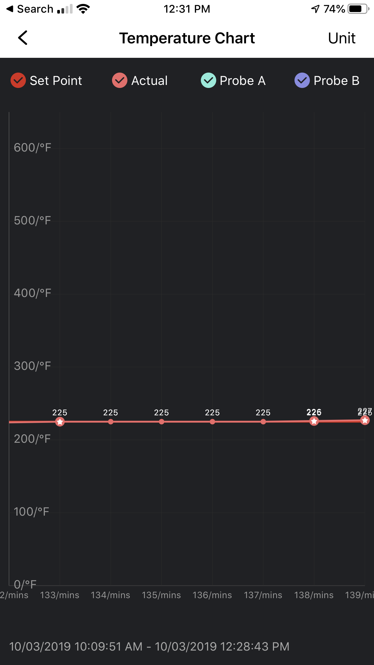
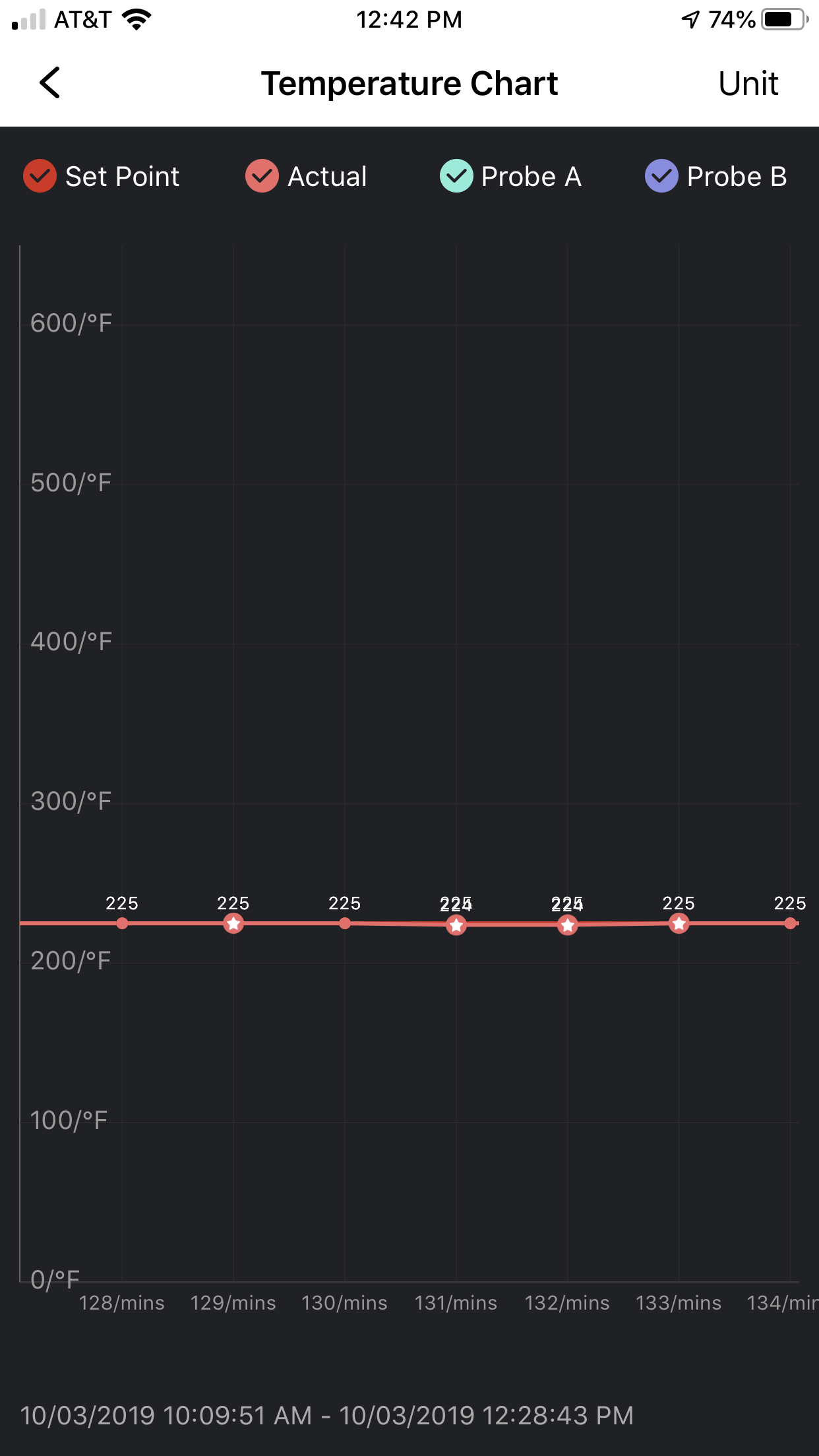
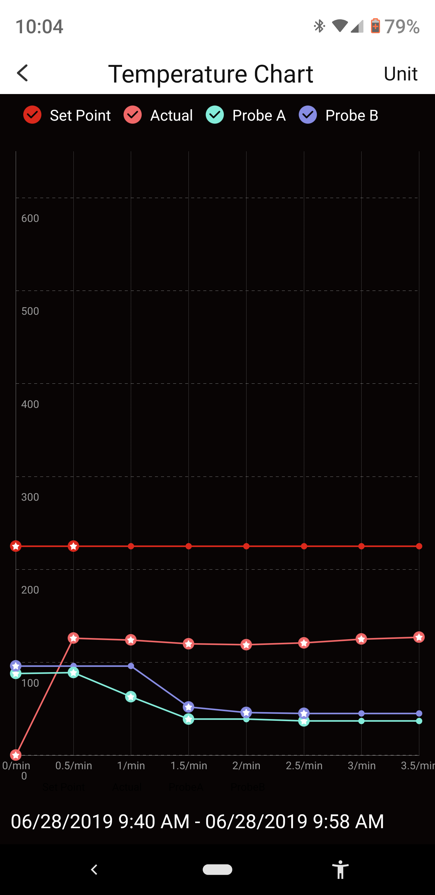
So why does the temp graph show a star at irregular intervals? Is it indicating the burner is lit?


Navigation
Install the app
How to install the app on iOS
Follow along with the video below to see how to install our site as a web app on your home screen.
Note: This feature may not be available in some browsers.
More options
You are using an out of date browser. It may not display this or other websites correctly.
You should upgrade or use an alternative browser.
You should upgrade or use an alternative browser.
Stars vs No Stars?
- Thread starter dixonduke
- Start date
Buckeye smoker
Well-known member
- Messages
- 1,382
- Grill(s) owned
- Bull
Trying to think from memory, but if your zoom in I believe that's where the set temp and actual temp are exactly the same...
Trying to think from memory, but if your zoom in I believe that's where the set temp and actual temp are exactly the same...
No sure what the rhyme or reason is, but I am sure there is on as it was a programed response?
looking at the screenshots above I can see it at 225 with a star and 225 without a star. Hmmmmm.....
Buckeye smoker
Well-known member
- Messages
- 1,382
- Grill(s) owned
- Bull
Yes, but you can expand the screen (zoom in) and see more detail. I'll DBL check what it is on my next cook.
No worries and thanks. I guess the pics I posted weren't clear enough as it shows the set temp at 225 and the "actual" temp at different degrees, above and below 225 with and without stars.


This is just a curious question, not an issue at all.
This is just a curious question, not an issue at all.
Buckeye smoker
Well-known member
- Messages
- 1,382
- Grill(s) owned
- Bull
Ok I found an old pic I had and the star is on every temp. I believe it's markers you can also click on to see the temp in a box with digits (223°)..etc. I'll still check when I cook again.

Buckeye smoker
Well-known member
- Messages
- 1,382
- Grill(s) owned
- Bull
@dixonduke figured it out...lol the "stars" do mark the time duration you pick to display on the graph...lol ! So, set at 15mins =star every 15.
The amount of stars (markers) change with duration selection. The "no star" dot is where temp at that marker remained the same.
The amount of stars (markers) change with duration selection. The "no star" dot is where temp at that marker remained the same.
I wish I could confirm your analysis. For me, the graphing tool on the App (as well as the alarms) hasn't worked in some time, and I have given up trying to see. (iOS user).
Bytor
Well-known member
I have been wondering the same thing. I can't figure out what the stars are supposed to mean. On a side note, is the graph only viewable in portrait mode and not Landscape? I can't get the screen to rotate. Was just wondering if it's a phone (android) issue.
I have been wondering the same thing. I can't figure out what the stars are supposed to mean. On a side note, is the graph only viewable in portrait mode and not Landscape? I can't get the screen to rotate. Was just wondering if it's a phone (android) issue.
Yea, the app only works in portrait mode, and does not rotate. You are able to "Pinch/Zoom" the chart to see more or less of the time line.
As for the stars... in my posts above I am showing it at a 1 minute intervals when the temp was set for 225 Degrees. The Stars are randomly appearing, at first I thought it was when the Set Temp and the Actual Temp were the same. But that is not the case, well if it it is not consistent. There are stars when both actual and the set are 225, then no stars when both are 225. Then there are stars when the set is 225 and actual is 224 or 226... Hmmmm.
Ultimately the stars make no difference on the cooking, but the curious george in me wonders what are the stars actually signifying.
@dixonduke figured it out...lol the "stars" do mark the time duration you pick to display on the graph...lol ! So, set at 15mins =star every 15.
The amount of stars (markers) change with duration selection. The "no star" dot is where temp at that marker remained the same.
Not sure that your hypothesis is repeatable on my end. If you look at the pictures I shared when using the 1 minute time duration to display on the graph, and the temp set to 225 you will see Stars when both the actual and the set temp are at 225 and no stars when both are at 225, as well as when the actual is not at 225. .... Curious for sure.
Buckeye smoker
Well-known member
- Messages
- 1,382
- Grill(s) owned
- Bull
I also noticed when I had changed the time duration that it had dots instead of stars in certain spots because I had changed the time. So at points it had dots in old points and stars in the new time setting. I deleted my graph pics from yesterday, I'll do this again next cook I do. And get better visuals sorry.
I also noticed when I had changed the time duration that it had dots instead of stars in certain spots because I had changed the time. So at points it had dots in old points and stars in the new time setting. I deleted my graph pics from yesterday, I'll do this again next cook I do. And get better visuals sorry.
Totally no apologies needed. This is sooooo not important, its just a.. I don't know how to describe it, other than a curious thing.
When you do your next cook, Get down to the 1 Min intervals and zoom around, see if you see what I am seeing.
Buckeye smoker
Well-known member
- Messages
- 1,382
- Grill(s) owned
- Bull
Mastertech59
Well-known member
The stars on the graphs are when the grill reported back to the mother land ?

Last edited:
